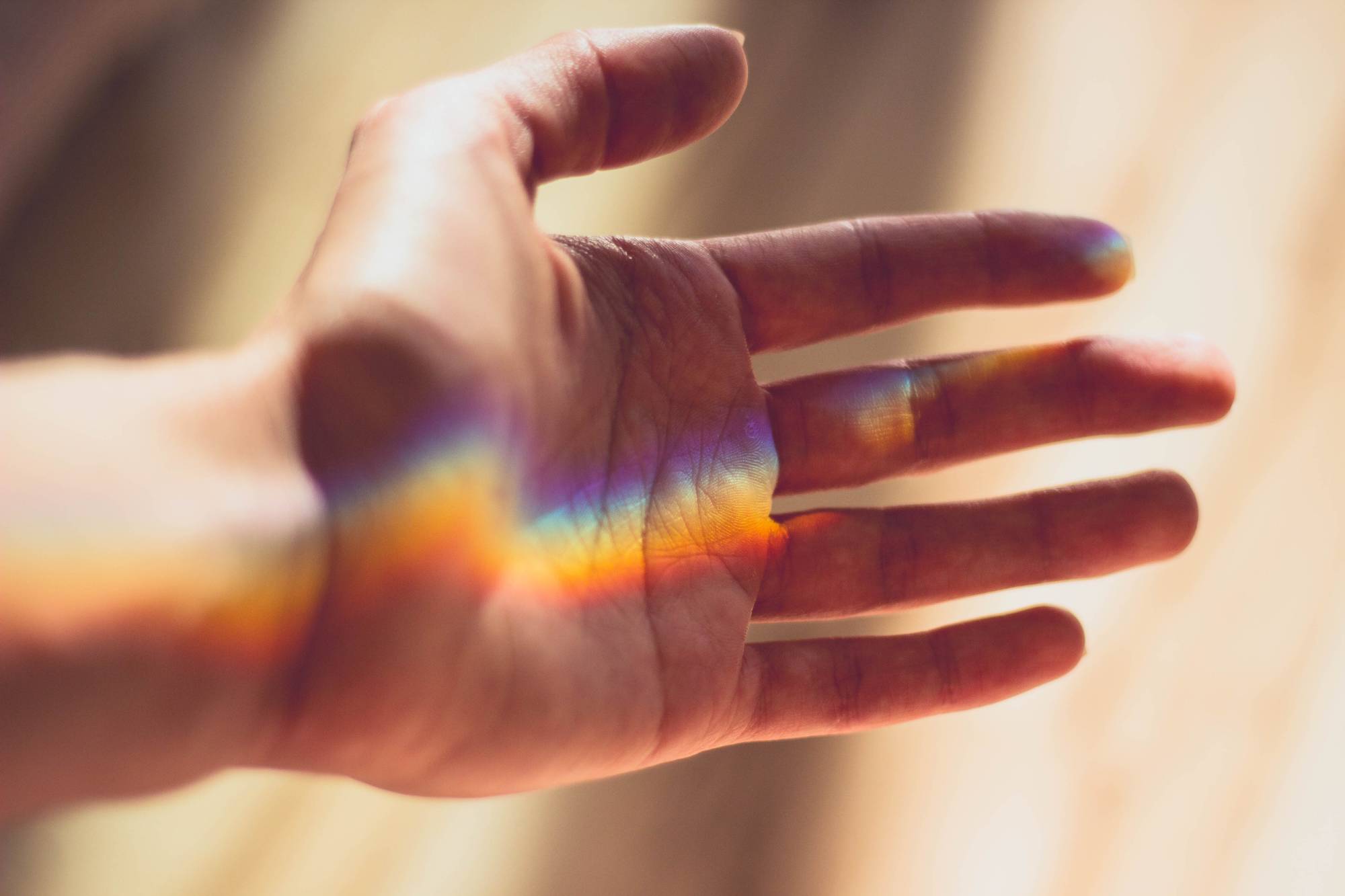
What is colour psychology?
Colour psychology is the study of colours, pigments, and/or hues, and their effect on the human physiology. Colour psychology examines humans’ emotional responses to certain hues, how colour impacts purchasing patterns and how colour can be most effectively employed as a marketing tool, how colour influences decisions we make around the foods we eat, and how colour can help create a particular atmosphere.
Fun Fact: In a recent experiment, scientists blindfolded a number of volunteers and fed them slices of pizza. There was nothing wrong with the pizza, it was fresh, and the volunteers were enjoying their meal until they were asked to remove their blindfolds. At this point a number of volunteers became physically ill, as the pizza was dyed with food colouring to appear as though it was mouldy. In other words, the pizza, which is usually shades of yellow, orange, and red (which are colours we associate with fresh, wholesome foods), was dyed shades of blue and green. Because the pizza was dyed blue and green, the subconscious psychological impact was so great that some of the volunteers couldn’t hold onto their lunch and reacted as though the food had been bad, when, in actual fact, it was perfectly fine.
While colour psychology is a fascinating phenomenon it is, however, important to note that responses will vary due to factors such as age, gender, culture, and personal experience. For example, heterosexual males report that women wearing red are more attractive or are trying to be perceived as attractive; whereas women have reported no similar such phenomenon when it comes to men.
Despite the possibilities for variance in result, colour psychology is widely used in marketing and branding, because most people are more similar than they realize, and are subconsciously affected by colours, even when they don’t realize it. In window displays, for example, warm colours tend to attract spontaneous visitors, despite the fact that cool colours are preferable almost across the board.
It is very important to consider the kind of atmosphere you want to create when you’re designing your interior. A corporate office-type space that is meant to evoke a sense of dominance, power, and hierarchical structure should thus be decorated and furnished in a completely different colour palate to, say, a psychologist dealing with sufferers of PTSD and anxiety disorders.
As a general rule, the following colours are associated with the following emotions and associated subconscious responses:
Red
 Red is typically associated with lust, romance, strength, energy, basic survival, the ‘fight or flight’ phenomenon, danger, stimulation, excitement, defiance or aggression.
In the Western World, red typically means “stop”, as in stop signs and traffic lights, and is usually perceived as an authoritative colour. If a woman wears red, this authoritative colour is perceived to indicate promiscuity or sexual deviance; perhaps as a result of the general perception of women’s enjoyment of their own sexuality as deviant and/or defiant.
Red is a strong, primary colour. This colour is not subtle. It is stimulating, whether construed positively or negatively, there’s no denying that.
Orange
 Orange is typically associated with warmth, comfort, health, vitality, frivolity, vivaciousness, and immaturity.
As a secondary combination of red and yellow, orange is stimulating, like red, but evokes an emotional response, like yellow (which is also the colour of creativity). Orange is perceived as a “safe” colour, from a food point of view, and the colour plays on our subconscious, baser instincts. Orange is a fun, loud colour and is very eye-catching and demands attention. However, when paired with a colour like black (as in Halloween every year), orange can become unsettling, anxiety-inducing, and a symbol of depravation and frivolity.
Yellow
 Yellow is the colour of creativity and creative energy. It is a hyper-energetic colour, and can even aggravate or irritate those sensitive to the psychological impact of colour. It is an emotional colour associated with optimism, sunshine, self-confidence, friendliness and extroversion, but can also be associated with depression, anxiety, emotional fragility and fear.
As a rule, yellow is the colour that evokes the biggest emotional response in people. The right shade of yellow will lift your spirits and leave you feeling psychologically invincible. The wrong shade, or too much of the colour, can leave you feeling terrified or anxious. Yellow is thus best used in moderation in interior décor in a corporate or hospitality environment; but can be a wonderful colour to bring into the home, given that it is a positive shade.
Green
 Green is associated with the earth, with nature, with peace and tranquility, with harmony, love, and with restoration. However, green is also associated with illness, nausea, jealousy, boredom, stagnation, and blandness.
On a primitive level, we are reassured by green, as an abundance of green represented a lack of threat (of drought, of starvation etc.). Green can bring peace to a space, but can also be considered boring, especially when it seems the predictable choice.
Blue
 Blue is the colour of calm, of the ocean, of peace, of the mind, of the intellect, of logic, of reason, and of trust. But it is also the colour of aloofness, coldness, unfriendliness and emotionlessness.
Blue is a wonderful colour to bring into a space that is meant to be calming but not relaxing. Blue is about clarity of thought, and the ability to work without interruption, and without holding onto negative emotion. The right shade of blue can thus be a great choice for an office space. Choosing a more vibrant shade of blue will be vitally energizing, and not considered boring by the younger employees, as a navy blue might be considered boring and very old-school.
Purple
 Purple is a colour associated with the spiritual plane, and spirituality. It is a transcendental colour. It speaks of luxury and quality, but can also be perceived as introverted, repressed, or decadent.
Purple, as a colour, encourages introspection and reflection, and can aid in meditation. It is therefore a popular colour for yoga studios and other such spaces. Purple has associations with the cosmos, and space, and can make a person feel small, and drive people to turn inward. However, too much, or the wrong use of purple, becomes cheap and nasty, fast!
Black
 Black speaks of luxury, expensiveness, sophistication, class, simplicity, modernity, and style. However, it can also speak to a sense of dread, of darkness, of despondency and disinterest.
When incorporating black into your space it is all about how and where the colour is used. A black couch, for instance, is relatively standard and doesn’t change the feeling of a room in the same way that a black accent wall does.
White
 White is associated with sterility, cleanliness, hygiene, efficiency, purity and simplicity. When paired with black it speaks of sophistication and either old-school charm or monochrome modern eclecticism. However, white can also leave one feeling threatened, as it can be perceived as impersonal, cold, sterile, and elitist.
When you envision your perfect space, what colour is it? If you have a mental “happy place”, what are the kinds of colours reflected in the picture? Is it perhaps of a blue sea at peach sunset? Or is it in a green jungle filled with brightly coloured tropical flowers? Understanding how certain colours make people feel is the first step towards creating a welcoming corporate or hospitality environment. Understanding how colours make you feel, is the first step towards turning your house into a home; a space of comfort. If you’d like us here at VISION SPACE to help you envision your space differently, or turn your dreams into realities, Contact Us to set up an appointment today!